Now that we have established the basis for our two major growth dimensions, loving God and loving others, we can begin to discuss how to measure and visualize maturity. For now, this post assumes that there is a means by which we can measure maturity (granted, a big assumption) and focuses of visualization for the purpose of reinforcing the concepts already discussed.
There are four views discussed in this section. The first is mostly a basis to begin with…a simple bar chart reflecting the current state of a disciple in terms of how far they have progressed along the knowledge, character and behavior dimensions.
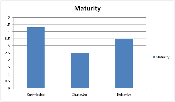
Here we see that this person has grown most in knowledge, second in behavior, and third in character…a pretty typical distribution. It is not depicted, but one can easily see where phases of maturity can be drawn at various levels. If the range of maturity values is 0 to 5, perhaps phase 1 is 0-2, phase 2 is 2-4 and phase 3 is 4-5?
Now if we were break down each dimension into smaller parts using the cross-cutting themes (or categories) discussed earlier, this bar chart might look something more like the following.
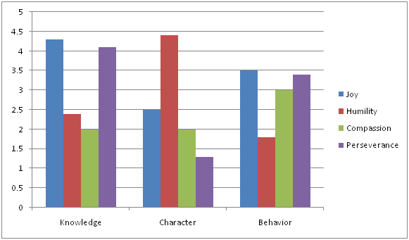
Here we can see inside each of the major dimensions to understand the component pieces. This tells us what areas of knowledge, character and behavior are strong and which are weak. In the graph above, we see that this person’s attitude is very humble but not very persevering. With this information, a faith coach can target this area of weakness with disciplines aimed at building self-confidence and steadfastness unto overall perseverance.
Other views can be helpful as well. By stacking the values, we can get an aggregate view of knowledge, character and behavior.
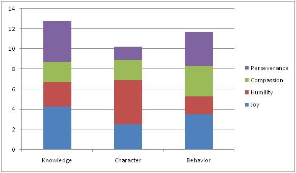
This is basically the same data as the earlier chart, only the bars are stacked one on top of one another rather than being side-by-side. The value of the previous chart would be able to see phase levels of each theme within each dimension independently; i.e. I can clearly see that this person is a phase 3 disciple with regard to a humble character but only phase 1 with regard to a persevering character.
The value of this stacked bar chart is to see keep the aggregate knowledge, character and behavior scores (and phasing) and yet add the component pieces to see relative (as opposed to absolute) strengths and weaknesses.
Finally, it’s important to see end-to-end measurements of each of the themes.
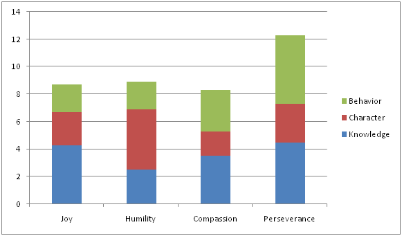
This chart looks similar to the last chart, but you’ll notice that the themes and dimensions are reversed so we can see maturity by theme rather than by dimension. I can see were my disciple is with regard to joy, including each component piece of knowledge, character and behavior.
What is the point to all this visualization mumbo jumbo? The point is that in order to be effective as a disciple and a disciplemaker, we must have some way of understanding where we are, where we are going and how we’re going to get there. The assessment tool can be used to gain a subjective understanding on where a disciple is in their walk; graphs like these can be used to visualize the conclusions; and discussions on what activities are appropriate to strengthen weak areas may then take place. At the end of the day, it’s simply about being more intentional about becoming more like Christ.